During the1960s period, a powerful reaction against the established norms of the society was developing throughout the glob which was later dobbed "the counterculture of the 1960s". The prolonged TV coverage of the U.S. military intervention in Vietnam, which for the first time could be observed in the living rooms along with the broadcasting of other social tensions including, colonial exploitations, struggles for democracy and liberation, race relations, women's rights, sexual mores and so on created a defiant attitude among the young university students and intellectuals that demanded a total reassessment of old values. In the cultural chaos that ensued many of the aesthetic values were lost, and while some new directions for art and artistic endeavors were discovered, the destruction of artistic criteria gave rise to the emergence of a new class of untalented charlatans that tried to get the maximum financial advantage from the prevailing turmoil. Unfortunately, institutions like the Tate gallery of London, in their blind competition to be more modern than the MOMA in New York, and therefore to attract more tourists, exacerbated this trend.

Andy Warhol - Campbell's Soup (1962)

Artist's shit - Piero Manzoni (1961)
The impact of the Pop Art era on graphic design, and the role played by artists like Andy Warhol, and Roy Liechtenstein is one of the least understood areas in the art and culture of the mid-twentieth century. These artists discovered a new and bold chromatic aesthetic, expressed mostly in spatial relationships of figurative art. Unfortunately, pop art was also the predecessor to "conceptual art" of the 1990s that was responsible for a flood of uncreative garbage, produced by charlatans that found the art market of the time gullible enough for accepting their products as art. This monstrosity has been interpreted by some as the reflection of the popular counterculture of the 1960s on artists. Some have tried to attribute the aesthetic of the pop to the mind-altering influence of drugs. Whatever were the causes, the fact remains that it had a devastating impact on the visual art scene. In the words of Barbara Kay:Conceptual faddishness soon colonized art schools, where pranks and performance theatre replaced serious skills-building. The Royal University of Fine Arts in Stockholm no longer teaches traditional drawing and painting techniques. But last January, as a (tax-funded) academic project, an art student in Stockholm was encouraged by her teacher to fake a suicidal tableau on a bridge, then dramatically fight, kick and bite her police rescuers and psychiatric examiners, all in aid of �questioning the accepted definitions of sanity.�
Instead of technically proficient craftspeople with respect for art�s traditions, these art schools are graduating preening fifth columnists. Decades ago, most art schools became, and remain, militantly politicized along politically correct lines. At the Oslo National Academy of the Arts, staff who defended two professors awarded figurative art and sculpture appointments were characterized by their colleagues as Nazi sympathizers.
Canadian schools are no better. A long-time male art teacher who stubbornly champions courses offering technical skills and figurative art at the Ontario College of Art and Design (OCAD) told me, �My students can�t draw and paint.� He added, �If you have talent with your hands and eyes, you�re out of luck at OCAD. Barbara Kay: The artist has no clothes, February 03, 2010.

White Painting (Three Panels), 1951, Robert Rauschenberg, In SFMoma
Roy Liechtenstein (1923-1997)

Roy Fox Lichtenstein was born in New York. His father, Milton Lichtenstein was a real-estate broker, and his mother was a gifted piano player. He had an uneventful childhood. He started to draw and paint as a hobby in his high school years. In those early days, he was fascinated by jazz players, and he tried to imitate Picasso's style of Blue and Rose Period paintings. In 1939, he entered the summer art classes of the Art Students' League under Reginald Marsh. He then enrolled in the School of Fine Arts at Ohio State University, but was drafted in 1943 into the army and served in Britain and continental Europe. After the war he returned to Ohio State University and finished his Bachelor of Fine Art in 1946. He then accepted an instructor position at the graduate program, and in 1949 gained his Master of Fine Art and exhibited his first solo-exhibition at the Ten Thirty Gallery in Cleveland.

In 1951 Lichtenstein exhibited his found-objects show in New York, and during the 1957-60 period he experimented with a number of styles, including Abstract Expressionism, Surrealism and Dadaism. His sophisticated compositions of surfaces were enriched by bold colors, letters and other symbols, such as maps and other esoterica l signs. In 1960 he was appointed Assistant Professor at Douglas College at Rutgers University of New Jersey. His proximity to the New York's art scene provided him with the opportunity to be in contact with a number of influential artists and critics. He became interested in the Pop Art movement, and in 1961 he produced a number of paintings that were based on comic-strip frames. By using Ben-Day dots, lettering and speech balloons, he added a new dimension to his paintings. Leo Castelli Gallery offered him a show which would feature his comic-based works in 1962. He participated at the Venice Biennale In 1966, and Guggenheim Museum exhibited a retrospective of his works in 1969.
Lichtenstein pulled the comics into a new paradigm, changing them from a humdrum existence with limited audience into a thought provoking art form where panels juxtaposed print, advertising and more to create a conceptual work for a more sophisticated audiences. His work showed that comics have stylistic characteristics that inescapably follow an aesthetic code. He worked on a number of subtle parodying of various styles including Cubism, Futurism and Surrealism.

All my art is in some way about other art, even if the other art is cartoons" -Roy Lichtenstein ( J. Hendrickson, Roy Lichtenstein, Cologne 2000, frontispieceLichtenstein's work is characterized by an inexhaustible ebullience and energy, manifested in his resolute appreciation of pop-culture. His images are dominated by the vivid primary colors, masterfully outlined with black lines. His nonchalant blunt conceits with perplexing, and often playful renditions of tawdry images are appended by thought balloons - which renders an enigmatic and visual sentiment. Similar qualities can be found in his three-dimensional graphic imitations of German Expressionist woodcuts in the early 1980s, and in his later works of painted or sculpted brushstrokes - which meticulously created an impression of modernist impulsiveness.
Lichtenstein was wholesome, freethinking and almost always a down-to-earth explorer. Perhaps he invariably conceived of the concepts of 'here' and 'now' as an amazing occasion and he was quite confident of how to deal with the uncertainties of this moment. More than anything else he was not a charlatan who would hide his lack of talent behind a discourse in philosophical nonsense -- a practice all too common these days. As Roberta Smith of New York Times has written:
The perfection of his paintings was achieved through extensive and beautiful preparatory studies, as indicated by his drawing retrospective at the Museum of Modern Art in 1987. It is not too soon to be reminded of this again, in a delicious survey of nearly 60 works. (NY Times January 12, 2007)In the late 80s Lichtenstein created a series of "Perfect" and "imperfect" paintings, in which he explored the reduction of form in the spirit of 'neo-geo' painting. They were deliberate gaudy composition of triangles, spheres and other geometric shapes, which according to him
Parody nameless or generic abstraction you might find in the background of a sitcom - the abstraction hanging over the couch. (Deborah Solomon, 'The Art Behind the Dots', in The New York Times, 8 March 1987)His "perfect" paintings were compositions made by a number of triangles that were constrained by the boundaries of a rectangular canvas. Lichtenstein explored the color tensions of these geometric surfaces with some humor. His ''Imperfect'' paintings, which according to him were supposed to be "humorous" were in some sense an evolution of his perfect paintings that some sides of those triangles extruded beyond the square frames of the canvases. According to the artist ''Art becomes this game of whether I hit the edges.'' These awe-inspiring and artistic work were scoffing at the philosophical tenet of the early modernists who criticized the pictorial illusionism of the three-dimensional spatiality in painting . His experimentation with shaped canvas and geometric imagery represented the formidable level of his inventiveness and sustained creative curiosity. Lichtenstein's rebellious challenging of the philosophical underpinnings of modern styles led to a straight forward resolution of aesthetic dilemma of the modern art.

"Imperfect" and perfect Paintings
Andy Warhol (1929?- 1987)
Andy Warhol's pop art was a byproduct of the technological revolution of the 20th century. As the critic Robert Hughes wrote in 1971.
Painting a soup can is not in itself a radical act, but what was radical in Warhol was that he adapted the means of production of soup cans to the way he produced paintings, turning them out en masse - consumer art mimicking the the process as well as the look of consumer culture... To look at an image like Campbell's Soup Can, 1965, is not to see it through Warhol's eyes�he has eliminated all idiosyncrasies. There is no contagion of personality. What remains is the flat, mute face of an actuality presented as meaning nothing beyond itself. (Art: Man for the Machin, Time, May, 17, 1971)What Hughes failed to mention is that Warhol's work, particularly silk-screen prints he made of political and Hollywood celebrities, including Mao, Liza Minelli, Jimmy Carter and Jacqueline Kennedy, were not only aesthetically pleasing in terms of their composition, color, and artistic sensitivity, but also were a new interpretation of portraiture � they amounted to a radically new conceptual paradigm. Warhol genuinely believed in the endless reproducibility of art.

It is not clear where or when Andy Warhol was born. It has been suggested that he might have been born around 1929, somewhere in Pennsylvania. The son of a coal miner, his family immigrated to the US from Czechoslovakia. Andy graduated with a degree in pictorial design from the Carnegie Institute of Technology (now Carnegie-Mellon University), in 1949. Immediately after graduation he relocated to New York and changed his name to Warhol. He became a successful commercial artist and graphic designer for Tiffany's, Bonwit Teller's, Vogue, Glamour, The New York Times and other magazines and department stores. In 1960 he started a series of illustrations based on comic strips, such as Superman and Dick Tracy, and on Coca-Cola bottles.
He tried to exhibit with Leo Castelli, an art dealer who was best known for representing the artists Jasper Johns, Roy Lichtenstein, and Robert Rauschenberg. Castelli declined to exhibit his work, since his gallery artist Roy Lichtenstein, was already painting from comic strips. However, Warhol's first exhibition of the Campbell's soup cans at the Ferus Gallery in Los Angeles in 1962, followed by his next exhibition at the Sidney Janis Gallery in New York finally convinced Castelli to represent him in 1964, and he remained his art dealer until his death.
In Warhol's Pop Art, consumer culture came face-to-face with itself reflectively , and that encounter was at once boastful and apprehensive -- apprehensive because the very fact of reflectiveness challenges self-absorbed consumption even as its temptation is acquiesced halfheartedly or placated fully. His art is not quaint or whimsical, because as David Dalton of the New York Times writes:
Over the six years period, between 1962 to 1968 when he was shot, Warhol created some of his most powerful images that were inspired by a profound reflection on the state of the consumer society, in which mass media have appropriated the role of man's brain, and dictated his choice through bombarding him with banal and senseless images that would sear in his mind his required course of actions through an endless repetition of commercial messages. Warhol created the banal art for the banal man. You no longer need to be a thinking and reflective entity. You are only expected to be a conformist robot, you should buy the over-the-counter drugs that would relieve your headaches and your heart burns, purchase a host of hygienic products that would make your hairs shine, and your skin look young and so on. Warhol's work meditated over a prevalent American mindset that extolled fame and celebrity status. He created the modern icons of this culture, using silk screen of not only stars such as Liz Taylor, Jackie Kennedy, Marilyn Monroe,and Marlon Brando, but also those rich and famous people who commissioned him to silk screen their images in the new style-- people like the Shah of Iran, his wife Farah Diba, his sister Ashraf Pahlavi, and Conrad Black a Canadian millionaire, and he obliged. Like any good businessman, he opted to maximize profit so when it didn't matter, he did not bother to clean up the imperfections of his silk screen prints; caused by slips of the screen, uneven inkings of the roller, and other defects. He was imitating a mass production process without any quality control. But he made sure that the image of the Shah would look exactly like one of his commemorating stamps, and the image of Ashraf would prominently display her diamonds.; Nevertheless, the imperfections, together with his enchantment with the American celebrity culture became the hallmarks of Warhol's work.
You can have him with or without irony, and it all still works. And because he was a master of the double-take, everything about him remains ambivalent. Once you choose one aspect of Warhol over another, you miss the point. Like Jean Cocteau�s definition of himself, Warhol is �the lie that tells the truth.� His paintings have the paradoxical quality of being both sexy and icily mechanical, and this ambivalence is at the core of his art. Even the affectionate nickname he was given at the Factory � Drella � is double-edged, a fusion of two disturbingly irreconcilable images: the waif-like Cinderella and the sinister, manipulative Dracula

Jasper Johns

Jasper Johns was born in Augusta, Georgia , in 1930. However, due to the marriage breakup of his parents, he was raised in Allendale, South Carolina by his paternal grandparents. It was in Allendale in his early childhood that he showed an intense interest in art. He has said; �In the place where I was a child, there were no artists and there was no art, so I really didn�t know what that meant ... I think I thought it meant that I would be in a situation different from the one that I was in.� Later on, he entered a high school in Sumter, South Carolina to be with his mother, He entered the University of South Carolina to study art, but he dropped out in the middle of his second year to enter the art scene at New York. However, he had to return to South Carolina, when the US Army sent him a summons in 1951. He served in the army until 1953, and a yrear after returned to New York, where he met a number of other artists including the composer John Cage, the choreographer Merce Cunningham, and another Pop artist Robert Rauschenberg.

The Dutch Wives (1975).
Johns became very interested in Marcel Duchamp�s work, after visiting his Philadelphia exhibition of �readymades� � created with a series of found objects. Inspired by Duchamp�s philosophy of looking at things differently Johns created �Walkaround Time", a performance with Merce Cunningham. In 1958, Leo Castelli's gallery discovered John's work at Rauschenberg's art studio and offered him a one-man exhibition, where four of his artworks was purchased by Alfred Barr, founding director of the Museum of Modern Art in New York. In his early work Johns reflected on the meaning of an everyday, almost absurd, subject matter. He found such a meaning in the painting process itself. His flag paintings was part of this process. The banality, absurdity and the enigmatic nature of the subject matter provoked viewer's curiosity for discovering a deeper meaning. Johns' own ambiguous and enigmatic explanation appeared to suggest that there is a deeper ontological meaning at work; �There may or may not be an idea, and the meaning may just be that the painting exists.� It is claimed that the writings of Austrian philosopher Ludwig Wittgenstein had a great influences on Johns' work. Although, John's works still show a high degree of artistic accomplishment, his was the start of a trend in which art appears to have morphed into a philosophical discipline, without any regards for aesthetically trained talent and artistic skill in the later modern art. In this prevailing trend in the visual art, the compositional component of the artwork is to be supported by an accompanying written explanation in order to grasp what the artist was getting at. The actual art work merely illustrates the concept. Apparently, in Wittgenstein�s work Johns recognized both a concern for logic, and a desire to investigate the times when logic breaks down! It was through painting that Johns found his own process for trying to understand logic!
Three Flags (1954-1955)
Nevertheless, Johns� printmaking experimentation and innovations in screen printing, lithography, and etching have been valuable artistic endeavor, notwithstanding, of course, his explanation that: �My experience of life is that it�s very fragmented; certain kinds of things happen, and in another place, a different kind of thing occurs. I would like my work to have some vivid indication of those differences.� In the 1960s, while continuing producing works with flags, numbers, targets, and maps, he began to introduce other objects such as paint brushes, beer cans, and light bulbs, into his later works. Johns has also illustrated the poet Frank O�Hara's book, In Memory of My Feelings; and Samuel Beckett's, Fizzles.

Target, 1974

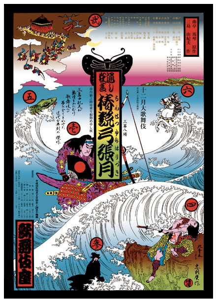
Tadanori Yokoo 
Tadanori Yokoo was born in Nishiwaki, Japan in 1936. He was interested in art at very young, and started his art career with reproduction of paintings. Soon after he was designing store wrapping paper, and drawing posters for the Chamber of Commerce. In his early posters he was influenced by the works of Seymour Chwast. In 1965 he participated in the Persona group's joint exhibition, in which his name appeared at the top of a dark, lyrical, and enigmatic poster, depicting a hanged man against a blue sky with red rays emanating from a rising sun. At the bottom corners some childhood photographs together with a stunning statement, completed the composition. The statement read; "having reached a climax at the age of 29, I was dead." With this poster "Yokoo style" in Japanese pop art was born in which rising sun is a recurring motif.


He became fearful of death ans stopped work after an injury in a traffic accident and the hara-kiri suicide of his close friend Yukio Mlshiman in the 1970s. He began a spiritual quest for a philosophical meaning and become interested in Hindu religion , Buddhism, UFOs, and extraterrestrial civilizations. He returned to art and began to create collages using images of the universe and various religious symbols. His work was noticed by various musicians such as the Beatles, Emerson, Lake and Palmer, Carlos Santana, and Cat Stevens who offered him projects to design their posters and album covers. Yokoo became especially close to John Lennon and Carlos Santana. In 1974, his cover for Santana's triple album "Lotus" was awarded the special jury prize at the sixth Brno Biennial .

 According to the art critic Yasushi Kurabayashi ; �Yokoo�s posters are not designed around conventional poster-like ideas. Rather his posters have been executed from his own desire for creative expression, with little regard for cognitive clarity or message.� Yokoo himself has said that he learned in the late 1960s "to escape from compromise when designing by linking my creations directly to my lifestyle." He is immersed in deep subjectivity, and his themes are about his personal desires, visions, fears and spirituality.

"Japanese Society for Rights of Authors, Composers and Publishers (JASRAC)," 1988

Shigeo Fukuda was born in Tokyo to a family of toy manufacturers, in 1932. As a boy he enjoyed making origami, the Japanese art of paperfolding, which began in China in the first or second century and then spread to Japan during the sixth century. He was still a teenager, when he became intensely influenced by the philosophy the International Style, or the Swiss Style; which was a reflection of the modernist and constructivist ideals. Fukuda was interested in styles' authentic pursuit of simplicity, and the idea that the beauty is inherent in the foundation of a purpose, and it cannot be the purpose of art was appealing to him. In practical terms, he followed the International Style's keen attention to detail, precision, craft skills, and supported a system of graphic design education and technical training that would aim at a high standard of craftsmanship and art in design and printing as well as a clear refined and inventive lettering and typoraphy.


He graduated from the Tokyo National University of Fine Arts and Music in 1956. In 1966, Fokuda's work gained prominence at a Czechoslovakian graphic design competition, and in the subsequent year his posters for Montreal's Expo '67 brought him the fame. His reputation began to snowball when Paul Rand noticing his work in an issue of Japanese Graphic Design Magazine helped him to exhibit his stunning, wooden puzzle-like sculptures at New York City's IBM Gallery. The structures were based on the design of toys which he originally created for his young daughter. In 1999, the Japan Foundation in Toronto presented the show �Visual Prankster: Shigeo Fukuda.�


 Fukuda's talent in visual communication design, using minimal graphic dimensions was at the foundation of his fame. He admired the clean and powerful design of Japanese woodblock traditions, and tried to link them to the modern global communication exigencies. Fokuda was an idealist, whose main body of work was created for social and cultural concerns. His 1980, poster for Amnesty International, which features a clenched fist interwoven with barbed wire, his 1982 Happy Earth Day posters; one with an upside-down axe, with a sprouting wooden handle, and another with the image of the earth in the shape of an opening seed awash in a pristine sea-blue background, and his most celebrated poster, Victory 1945 , with a cannon barrel that its shell firing, backwards, destroying the cannon forever, are examples of Fukuda's dark sense of humor, pointing to a childlike innocence that wishes for a better world. His Victory 1945 won the grand prize at the 1975 Warsaw Poster, and he devoted all the proceeds from the competition to the Peace Fund Movement.


Fokuda's boyish playfulness and enthusiasm for various pranks were a reflection of his philosophical outlook towards the world that were represented in his 1960s visual illusion of �Ryu Mita Ka?� (�Have You Seen the Dragon?�) in the Asahi newspaper, and Idea Magazine 's "Visual Circus." He had said;
Go to the next chapter; Chapter 34- Graphic Designers in the Fashion Industry
By the early 1970s Pop Art became internationally prominent. Pink Floyd worked extensively with London based designers, Hypnosis, to create graphics to support the concepts in their album soundtrack from the film More. Yellow Submarine which was was a milestone in graphic design, was inspired by the Pop art. Heinz Edelman was hired by TVC as the art director for this film. Despite the critical acclaim of his design work for the film, Edelman never worked on another animated feature. In 1967 The Beatles company "Nems" contracted Richard Avedon to create four posters depicting John, Paul, George, and Ringo. In the US they were published in "LOOK" magazine, and in England in the Daily Express Newspaper.

Unfortunately, a misguided belief soon took hold of the art scene. The belief was that the bold and strong color contrasts in the Pop Art works are created by the effect of mind altering drugs. According to Mati Klarwein a Pop Art painter;
I'll tell you about a funny episode. Jean Houston and Robert Masters put together a book called Psychedelic Art in the sixties, and they came to me. They did an interview with me, like we're doing now, to include me in their book. And they asked me, "What kind of psychedelics do you take when you're painting?" And I said, "I don't take anything when I'm painting. When I take psychedelics I get very horny, and I start going out to nightclubs and cruising." (laughter) So they said, "Well, we can't put you in the book." I freaked out, because I wasn't in any book yet (laughter), and I said, "But I get my ideas when I'm high." And they said, "Alright, we'll put you in the book." Next they asked me for the names of other psychedelic painters, and I gave them a whole list, including Fuchs. I called them all up right away, and I told them, "Tell them that you're taking psychedelics!" And they all got in the book.' (laughter)
This attitude gave rise to Psychedelic artificiality that relied on drugs and abandoned all the artistic aspects of the pop art, such as balanced composition, aesthetics, and authenticity. As the bars for achievement of excellence were persistently lowered, more and more of the publicity seekers around the world tried their luck by creating low quality, but highly controversial art-ificial objects. The criteria for acceptance became the shock value for the piece and how much controversy they generate. But there are signs that this tendency has began to subsided by the end of the 20th century, although some remnants of that era still lingers on in places that bureaucrats are still in control. In the words jdy Singer:
�The whole business: collectors, dealers, museums, universities, art magazines have nothing to do with what it takes to make a great work of art. Curators are not the trailblazers that they portray themselves to be, but rather, they are sheep, merely following trends. I challenge them to step out of the mainstream and show art that is great. To do this, they would have to know what it really is.� Judy Singer: Is art dead? February 19, 2010,

Tadanori Yokoo was born in Nishiwaki, Japan in 1936. He was interested in art at very young, and started his art career with reproduction of paintings. Soon after he was designing store wrapping paper, and drawing posters for the Chamber of Commerce. In his early posters he was influenced by the works of Seymour Chwast. In 1965 he participated in the Persona group's joint exhibition, in which his name appeared at the top of a dark, lyrical, and enigmatic poster, depicting a hanged man against a blue sky with red rays emanating from a rising sun. At the bottom corners some childhood photographs together with a stunning statement, completed the composition. The statement read; "having reached a climax at the age of 29, I was dead." With this poster "Yokoo style" in Japanese pop art was born in which rising sun is a recurring motif.

"having reached a climax at the age of 29, I was dead.", 1965
Yokoo has worked on virtually every aspects of visual communication including book designs, animation, prints, posters, album covers, Swatch watches, illustration, paintings and so on. In all his works he incorporates an eclectic artistic taste informed by a wide range of styles including Surrealism, Dada, Russian Constructivism, American Pop Art, contemporary Japanese popular culture and traditional Japanese art forms, especially the woodblock prints. His art is imbued with the postwar energy, of Tokyo with its cultural contradictions, human tragedies, and social challenges. In Yokoo's own words; �When I walk through the streets of Tokyo, it is not unusual for me to weave back and forth as if I were recovering from an illness.�
He became fearful of death ans stopped work after an injury in a traffic accident and the hara-kiri suicide of his close friend Yukio Mlshiman in the 1970s. He began a spiritual quest for a philosophical meaning and become interested in Hindu religion , Buddhism, UFOs, and extraterrestrial civilizations. He returned to art and began to create collages using images of the universe and various religious symbols. His work was noticed by various musicians such as the Beatles, Emerson, Lake and Palmer, Carlos Santana, and Cat Stevens who offered him projects to design their posters and album covers. Yokoo became especially close to John Lennon and Carlos Santana. In 1974, his cover for Santana's triple album "Lotus" was awarded the special jury prize at the sixth Brno Biennial .


"Japanese Society for Rights of Authors, Composers and Publishers (JASRAC)," 1988
Shigeo Fukuda


He graduated from the Tokyo National University of Fine Arts and Music in 1956. In 1966, Fokuda's work gained prominence at a Czechoslovakian graphic design competition, and in the subsequent year his posters for Montreal's Expo '67 brought him the fame. His reputation began to snowball when Paul Rand noticing his work in an issue of Japanese Graphic Design Magazine helped him to exhibit his stunning, wooden puzzle-like sculptures at New York City's IBM Gallery. The structures were based on the design of toys which he originally created for his young daughter. In 1999, the Japan Foundation in Toronto presented the show �Visual Prankster: Shigeo Fukuda.�


Fokuda's boyish playfulness and enthusiasm for various pranks were a reflection of his philosophical outlook towards the world that were represented in his 1960s visual illusion of �Ryu Mita Ka?� (�Have You Seen the Dragon?�) in the Asahi newspaper, and Idea Magazine 's "Visual Circus." He had said;
"I believe that in design, 30% dignity, 20% beauty and 50% absurdity are necessary. Rather than catering to the design sensitivity of the general public, there is advancement in design if people are left to feel satisfied with their own superiority, by entrapping them with visual illusion."According to Seymour Chwast in his introduction to �Masterworks� (Firefly Books, 2005), a monograph about Fukuda;
�Fukuda is not a communicator who conforms to the principles of accessibility. With few exceptions, his purpose is to mystify.�Shigeo Fukuda died in Tokyo on Jan. 11, 2009.
Go to the next chapter; Chapter 34- Graphic Designers in the Fashion Industry
References
- Masters, Robert E.L. and Houston, Jean Psychedelic Art New York: 1968 A Balance House book�printed by Grove Press, Inc.
- Robert R. Hieronimus and Laura Cortner, ''Inside the Yellow Submarine; The Making of the Beatles' Animated Classic'', kp books, February 01, 2002, ISBN 9780873493604
- Lobel, Michael. Image Duplicator: Roy Lichtenstein and the Emergence of Pop, Yale University Press, 2002, ISBN-10: 0300087624
- Michelson Annette,Andy Warhol (October Files, The MIT Press, 2001, ISBN-10: 026263242X
- Bader, Graham. Roy Lichtenstein (October Files,The MIT Press, 2001, ISBN-10: 0262512319
- Hendrickson, Janis. Lichtenstein: 1923-1997 (Basic Art),Taschen, 1994, ISBN-10: 3822896330
- Waldman, Diane. Roy Lichtenstein, Guggenheim Museum Pubns, 1994, ISBN-10: 0810968754
- Shafrazi, Tony. Andy Warhol Portraits, Phaidon Press, ISBN-10: 0714849669
- Hickey, Dave et al. Andy Warhol ''Giant'' Size, Large Format, Phaidon Press, 2009, ISBN-10: 0714849804
------------------------------------------------------------------------------------

This work is licensed under a Creative Commons Attribution-No Derivative Works 3.0 Unported License.
This work is licensed under a Creative Commons Attribution-No Derivative Works 3.0 Unported License.


